
OSEI Logo
Story & Inspiration Behind the Logo
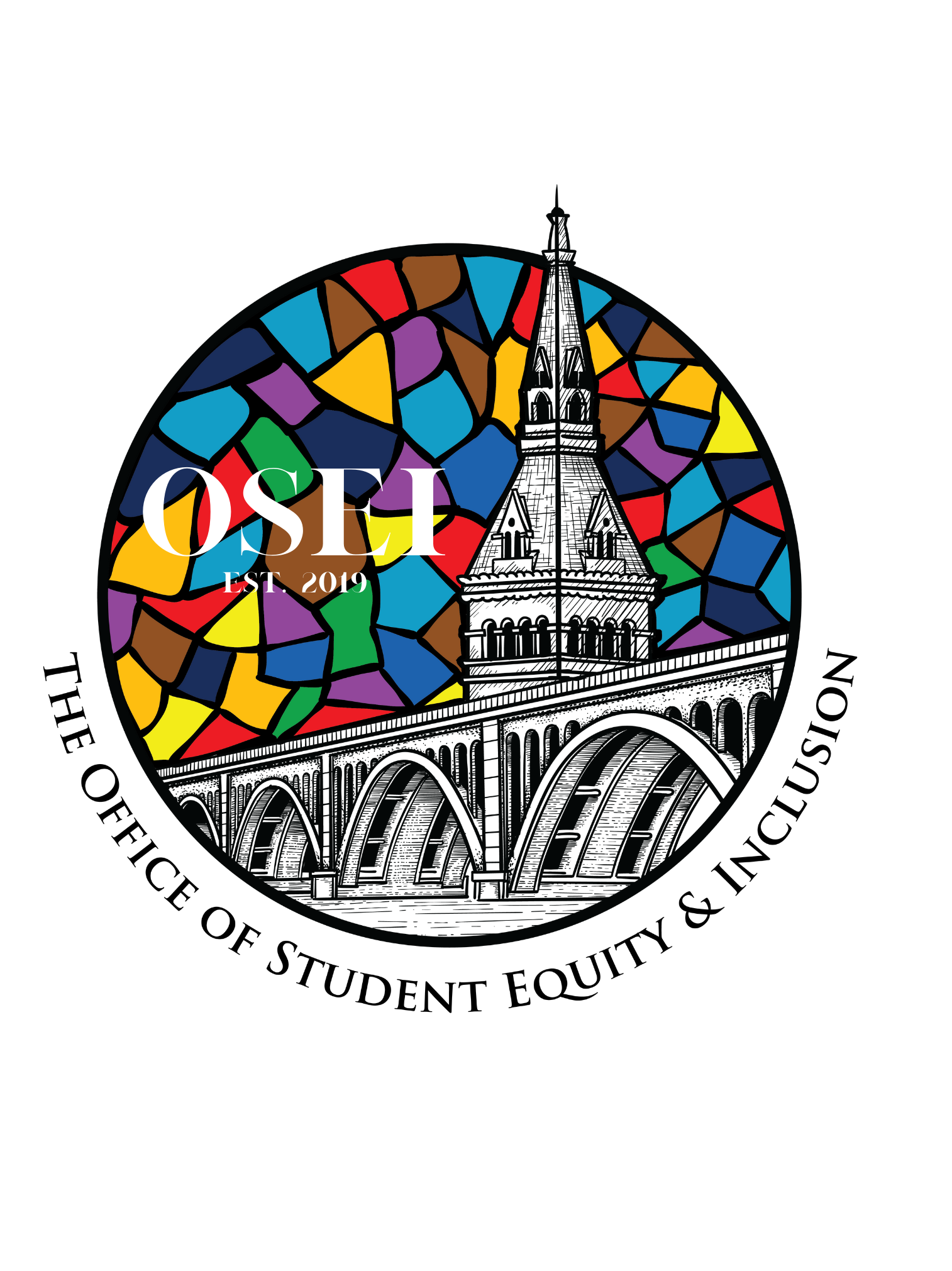
Overall, the inspiration behind this logo came from our initial programs, GSP, CSP and CMEA. We took building structures and color schemes represented in each of these programs’ logos and incorporated it into this final prototype.
Colors: The colors represent diversity, equity and inclusion; grey and blue shades represent Georgetown University; Colors used in OSEI’s initial programs (GSP, CMEA,CSP) are represented in this logo.
In diversity, equity, inclusion (DEI) spaces, the color red represents perseverance ; Blue, compassion: Green, growth; Violet, passion; Black, strength & unity; Yellow shades, glory; Gray, humility; Brown; wholesomeness; Orange, joy and success; Turquoise, wisdom & balance.
Shapes & sizes of pieces to “The Mosaic sky” : Mosaic’s tell a story and often demonstrate how all the different pieces/components (our students) of our community (Georgetown) come together to create something beautiful beyond what any one of us could create on our own. Each piece is unique representing differences, and mold beautifully together to represent inclusion.
Building Structure: Healy Hall, flagship building on the Hilltop Campus, represents Georgetown University and is named after the first African American President/Jesuit at Georgetown–Patrick Francis Healy.
Key Bridge: Bridges are used to move from one place to another, they are often suspended over obstacles literally or metaphorically, to another, it symbolizes people making a journey or crossing a boundary. This office helps students as they embark on their college journey’s. At times they may experience obstacles and OSEI supports them “like a bridge” as they reach success (graduation, academic success, personal/social growth, career aspirations, etc).
This logo is timeless as what it represents are long standing values of the institution.